
In 1998, Citicorp, a global corporate banking business, and Travelers Group, an investment and insurance conglomerate, formed a merger. The new company, to be called Citigroup, would be by far the largest corporate combination, with $698 billion of assets. They wanted a logo that reflected this merger.
Citicorp had type font that as in italic form, while Travelers Group had a red umbrella.

Source, Fair use, https://en.wikipedia.org/w/index.php?curid=20733611
There’s a ‘T’. The bottom of a lowercase ‘t’ has a little hook on the bottom. By putting an arc on the top, an umbrella is formed—and it took a moment of time to design the new logo.
Paula Scher
At the helm of the logo design was Paula Scher, from Pentagram, who has been at the forefront of graphic design for more than 40 years. This renown artist is a genius in typography, coming up with more ways to make type talk than anyone else and creating a distinctive body of work with just letters. She’s done album covers, posters, books, the Windows 8 logo, to name but a few—forging the visual language of a great deal of iconic brands and institution around the world.
However, behind the scenes, really then it wasn’t as simple as it seems. There were many suggestions, feedbacks, and criticisms flying all over the room. “What if you do it this way or that way?” “How would it look on a card, how would it look on a stationery?” “It’s got to be red on top and blue below.” Numerous things were being worked out for nearly two years before it actually launched.
Persuasion in Design
“The design of the logo wasn’t the hard part of the job. It’s persuading the millions of people to use it,” she says.
In Abstract: The Art of Design, I particularly loved a scene where she talks depicts a typical presentation to her clients. Using a curve similar to a damped oscillation, she illustrates how the amplitude of persuasion in your sales pitch diminishes with more refutations in a prolonged session—regardless how wonderful a design is. Here’s how it goes.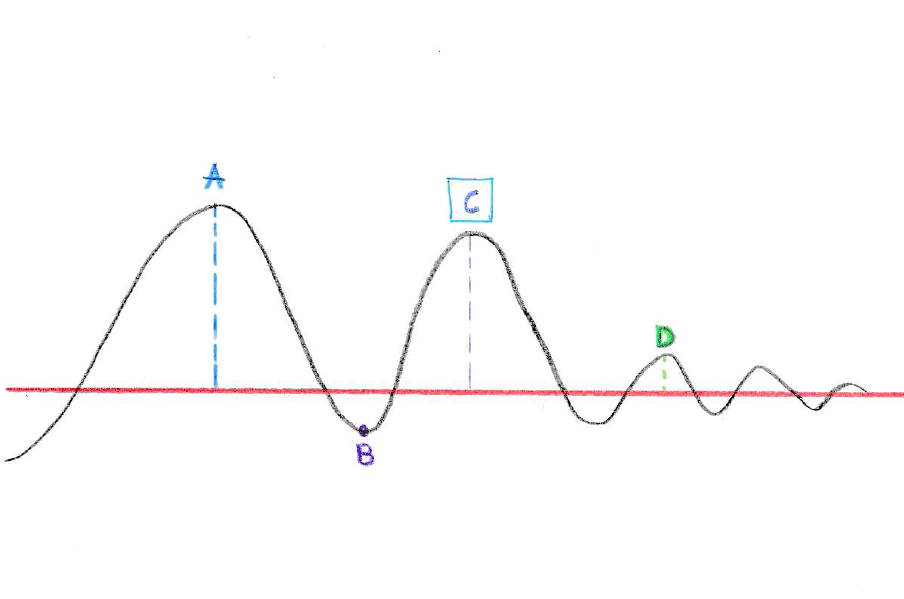 The red line is the line of the reasonable level of expectation that everyone has when you enter the discussion room. You begin to present and you come above the reasonable level of expectation. Everyone gets enthusiastic, people begin to start asking questions. At Point A, you have reached the peak of the appreciation that you are going to get for this presentation. And at this point, somebody is going to make a rebuttal to your presentation. You are going to sink a little bit below that line of expectation (Point B). You grab it back and you make some concessions. And you manage to get up to about here (Point C). And at this point, this is as high as you’re ever going to get. It’s not as high as Point A, but it is good.
The meeting must then end here (Point C), because what will happen is a counter-rebuttal to your offer, and it will go down below the reasonable level of expectation, and then come back only nearly above it (Point D). This will continue on until you reach sudden death.
They want proof that it is really going to work, but the problem is there isn’t proof. It’s how people see, perceive and accept things—how you make them discover and become cognizant of things. An uplifting insight gleaned from Paula Scher that’s certainly worth a ponder.


